

UI/UX Design for a Wellness Website
Turning patented neuro-acoustic science into a site people actually understand.
Project overview
YouMind® is a wellness brand built on something genuinely technical: personalised neuro-acoustic protocols, grounded in years of research. That puts a specific demand on the design. It has to feel credible enough to be taken seriously, and calm enough to belong in the wellness space, without tipping into either extreme.
We handled the full UI/UX, from research and structure through to the visual language and interaction design, then carried it into a custom WordPress build. The look is deliberately restrained. A quiet base, one accent colour doing real work, generous spacing, and motion used to set the pace rather than decorate.
The structure does the rest. The homepage opens with one clear promise and an obvious choice of where to go next, heavier technical content sits deeper for anyone who wants it, and a shared component system keeps every page consistent as the site grows.
The brief
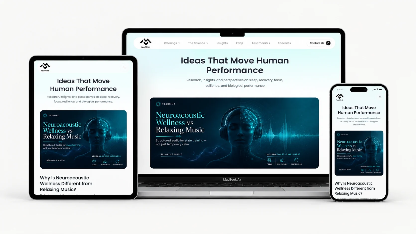
YouMind® needed a design for a wellness brand built on something genuinely technical: personalised neuro-acoustic protocols, grounded in years of research. The challenge wasn’t the science, it was the feel. The design had to look credible without turning cold, and calm without turning generic.
Wellness design tends to drift one of two ways. Soft, with pastel gradients and stock photos. Or clinical, with dense text and no warmth. YouMind® had to sit between them.
So we were asked to create the full UI/UX: the structure, the visual language, and the flow that carries a visitor from the first screen to the point where they know exactly what they’re looking at.
Finding the visual direction
The first decisions were about restraint. A deep, quiet base with a single accent colour, generous space between elements, and typography that reads as considered rather than clever. Nothing decorative that didn’t earn its place.
Motion did a lot of the work that colour usually does. A slow ambient hero, soft transitions between sections, and a scroll that never jolts. On a site about calming the nervous system, the interface itself needed to feel that way.
“We didn’t want it to look like every other wellness brand. The design gave us something that feels calm but still serious, which is exactly the line we needed to walk.”
Yeasin, CEO at YouMind®
Structuring the experience
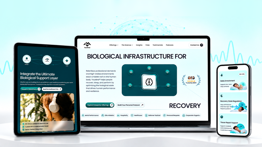
YouMind® speaks to people who arrive with very different needs, so the homepage had to answer “which part of this is for me?” almost immediately. We designed the opening screens to state the promise once, then hand the visitor a clear choice of paths.
From there, depth is optional. The heavier science sits on its own pages for anyone who wants it, while the surface stays readable for anyone who doesn’t. Longer content like the FAQ and the comparison table was broken into scannable blocks rather than stacked paragraphs, so the density never lands all at once.
What shaped the design
- A restrained palette so the accent colour carries real weight
- Clear entry points on the homepage instead of one flat service list
- Layered depth, with technical detail on its own pages
- Comparison content laid out visually rather than written out
- Motion used sparingly, to set pace and tone
- A component system that keeps every new page consistent
- Layouts designed mobile-first, since most wellness traffic arrives on a phone
“The hard part wasn’t making it look good. It was deciding what to leave out. Once we stripped the design back, the content had room to do the talking.”
Rahul Das, Lead Developer at Web Rahul
The result
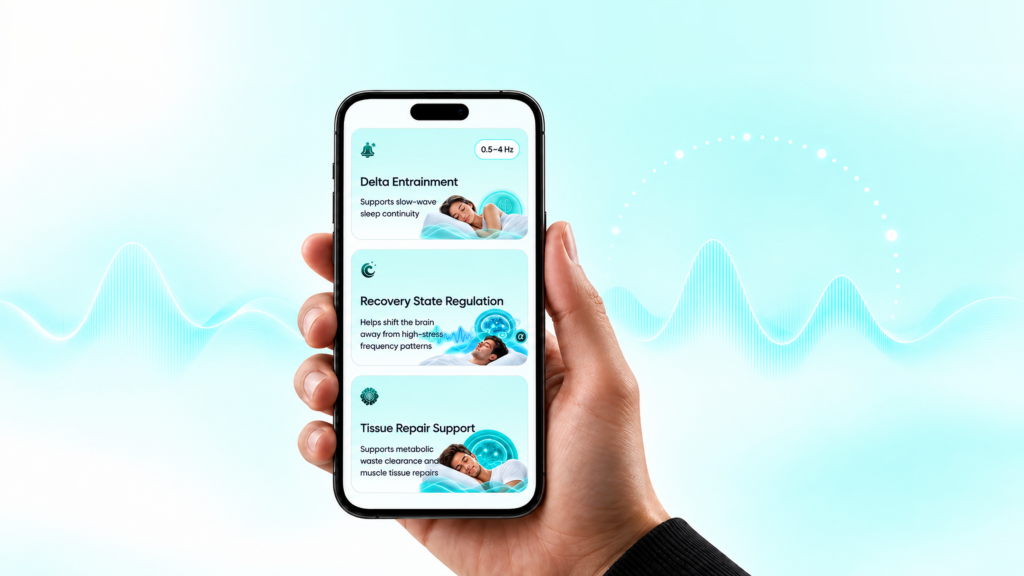
The finished design gives YouMind® an interface that matches what they actually sell. It reads as premium without being cold, calm without being vague, and it holds together across every page because the system underneath it is consistent.
It’s also built to grow. New pages, articles and sections drop into existing components, so the design stays coherent as the site expands.